
26961 Camino De Estrella, Suite 300
Capistrano Beach, CA 9624
Call Us: (949) 276-6063
26961 Camino De Estrella, Suite 300
Capistrano Beach, CA 9624
Call Us: (949) 276-6063

These six tips are universal, but charter schools, private schools and college marketing is a pet project of mine, so we have a lot of experience we can relate to.
Author’s Note: These 6-tips are based on our downloadable eBook “25 Website ‘Must Haves’ for Driving Traffic, Leads & Students to Your School”. Available free for schools and educators.
Your Website is the Hub of all your online marketing activity, it’s even a destination for offline marketing. Sooner or later every parent or student that you successfully target will eventually wind up on your website.
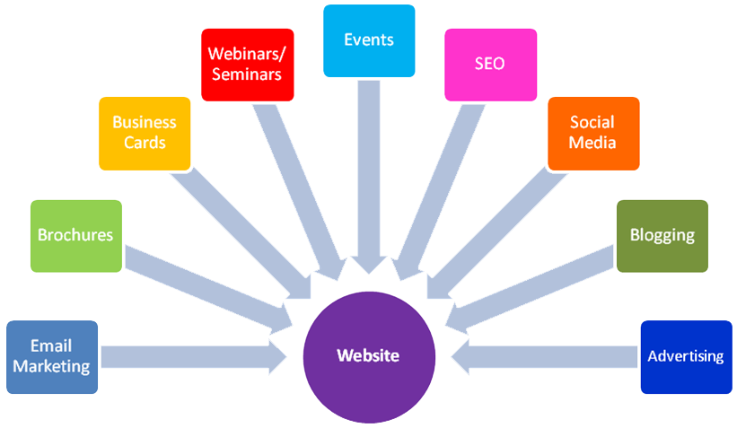
There's more to marketing a school than just the website, but sending good traffic (motivated parents) to a bad or mediocre website is not only a waste of time and money, but can do more harm than good. If they don’t like what they see, they won’t be coming back. Here are the Minimum Requirements for an effective school website:
As of May 2015, Google reported that there were now more searches on mobile devices than desktop computers. Consider your demographic; for example, if you were marketing a charter or private school, parents of school aged children are on mobile devices more than on desktops. If you were marketing a college, students are attached to their mobile devices like it was an appendage.
Entire websites are now being designed for mobile devices first, and desktops as a secondary consideration. The odds are very high that your website or landing page will be viewed on an array of different sized mobile devices as much, or more than their desktop counterparts. Did you ever try filling out a tiny form with little buttons on a smart phone? Enough said.
Our design team has taken to designing for mobile first. If a website looks good on a smartphone, it will probably look good on a desktop. The inverse is not always true.
Do not make parents think too hard on the wrong things. You want them to concentrate on considering your school, not on guessing where to go next on your website.
They’re on a mission to find what they are looking for, and you are on a mission to make sure they find it. People appreciate “clever”, but not at the expense of time. Organize your content so parents can quickly locate the information they are looking for in no more than 2 clicks when feasible.
Minimize, and organize your navigation buttons. Parents and students should be able to quickly scan the navigation and intuitively chose the right path. Too many navigation choices is not scanning…it’s reading at that point.
People see images long before they see anything else, so your image selection is critical. Images can tell a story in a fraction of a second…so they better be telling the story you want to tell. Images should not be used just to fill up white space and should be carefully selected.
Feature images that parents can relate to, such as children of the appropriate age group, kids having fun and learning. Images should be appropriately diverse based on our actual makeup of your school.
Stock photos of children are fine, but “branded” images are even better. Images of the actual school, or children or faculty wearing logo apparel (for example) are even better because they will have sense of realism and trust.
Images of the faculty and administrators can humanize the school and create a sense of trust and accountability. Use high quality images that tell a story or set the mood. Do NOT use gratuitous images just for the sake of filler.
People don’t read on the Internet, they scan. They see headlines, images and bullet points. Parents will read more based on the importance of what they are considering (their child’s education), however, structure your content to “spoon feed” the content to them by organizing it in logical progressions. Your Headlines should be “Scanable” but your body copy should be “Snackable”. Unless the purpose of your website is to sell a book, don’t write a book.
5: Layout:
Uncluttered. Whitespace is very powerful. It should be comfortable to browse through your site without having to face massive blocks of text. If it looks good on your smartphone, it will probably look great on your computer. The reverse is not always true.
Keep it simple. One of the common mistakes many schools make is trying to cram too much content on their homepage. The best homepages are easy to read, quickly guiding you to relevant information.
6: Message:
The Internet is Short Attention Span Theater. You have between 2-8 seconds for a visitor to decide what their next move is from the moment they arrive on your page. They see headlines, images and bullet points, and if they like what they see, they may actually read something or start their buyers’ journey. Benefits before features is best practice.
For Schools & Educators:
How does your school’s website rate against competing schools in your market? Are there any major, but unseen issues inhibiting enrollment? Are there any simple opportunities for improvement? Have you ever considered a professional, independent evaluation of your schools' website and web-presence?
Here’s your chance: We are offering a professional website audit and evaluation, free for schools and educators. If you qualify, click here to learn more ↓

Enrollment Strategies & Support for Schools & Businesses
The Schoolmasters Guide to Enrolling more Students

The Schoolmasters Guide to Selecting the Best Marketing Team
Sometimes just doing the basics makes all the difference.
© Copyright , Kreative Webworks Inc. - All Rights Reserved