
26961 Camino De Estrella, Suite 300
Capistrano Beach, CA 9624
Call Us: (949) 276-6063
26961 Camino De Estrella, Suite 300
Capistrano Beach, CA 9624
Call Us: (949) 276-6063
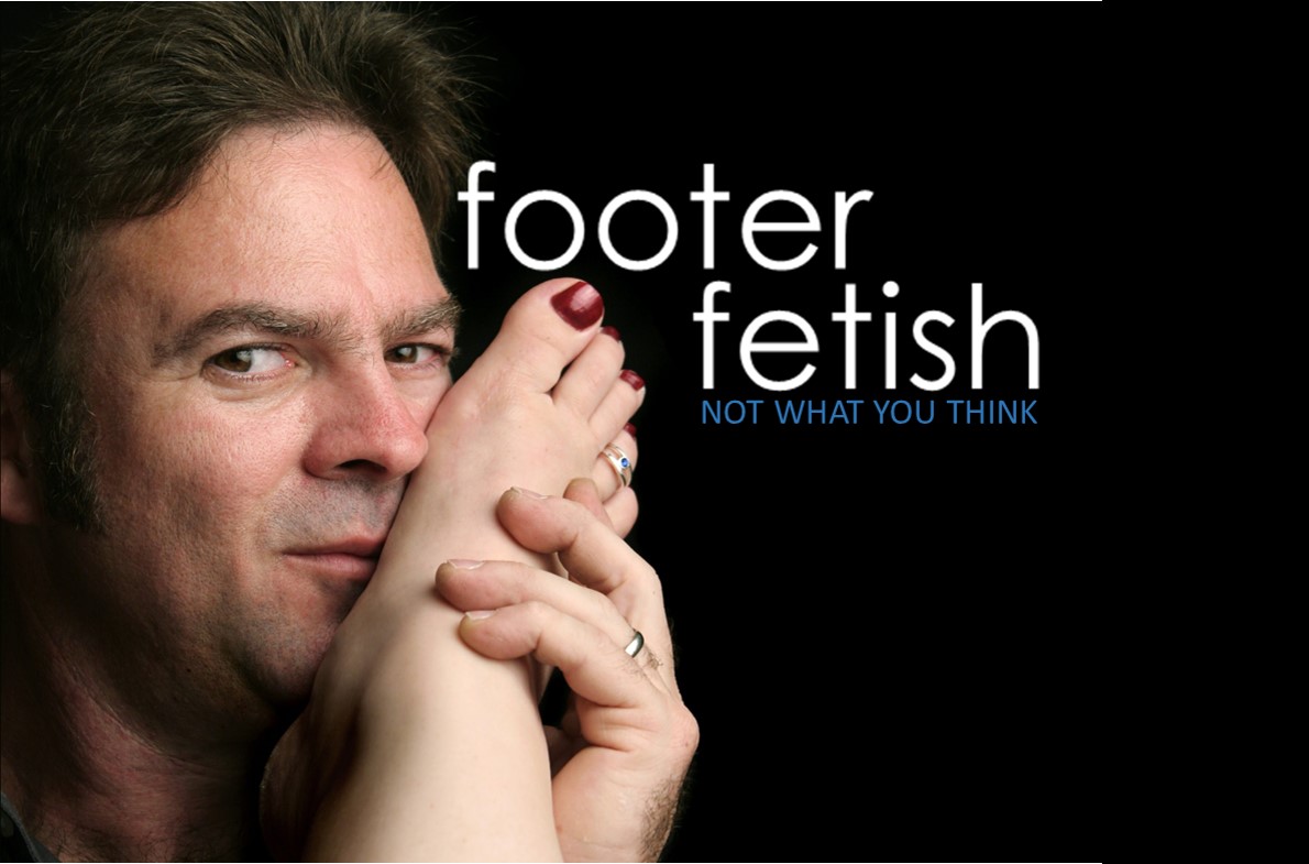
Probably the most underutilized section of any website is the footer. You know…the very bottom of the page where you usually see the outdated copyright?
Here’s your chance to add value to your visitors, find a place to put all that boring stuff that you’re sort of obligated to provide… and perhaps show off a little creativity in an otherwise underappreciated section of your website.
I usually think of the footer in terms of useful stuff and boring stuff. Traditionally it’s where you would stuff the boring stuff. You can do better…
Links to Your Services: Since the footer by definition is at the bottom of the page, that’s a convenient place to add links to other important pages on your website. At this point they’ve already seen the content of whatever page they’re currently on, why make them scroll up to the top to navigate to additional pages?
Link to your Site Map: Not necessarily exciting, but this can be useful to your visitors who want to get a more global view of your website to choose where to go next. It’s probably not going to hurt your search engine optimization by making it easier for Google to crawl your site and index the pages. It’s a no-brainer.
Contact Info: At a minimum, you should include a link to your “About Us” page, and without exception, your “Contact Us” page. Also a great place to reiterate your phone number (or multiple numbers). Most people won’t have much trouble locating your Contact page, but every time you put your phone number in front of their face, it’s like an invitation to call.
Locations: If you have multiple locations, the footer is a great place to list those. Not only will that be good info for your visitors, but if you link them to individual pages or even verified online listings, you just might get some of that Google love.
Social Media Icons: Wondering where to unload all those colorful little social media icons? Look no further… plenty of room on the footer. There’s only about a billion free social media icons out there. Pretty sure something will look nice on your background.
Trust Icons: Got great reviews, or part of a noteworthy organization that enhances your credibility? Remind everyone on the bottom of every page by putting those BBB and Yelp logos where everyone is bound to see them sooner or later. Make sure that you link to your mention on each of those websites....but don't forget to open those websites in a separate window so your visitors don't actually leave your website.
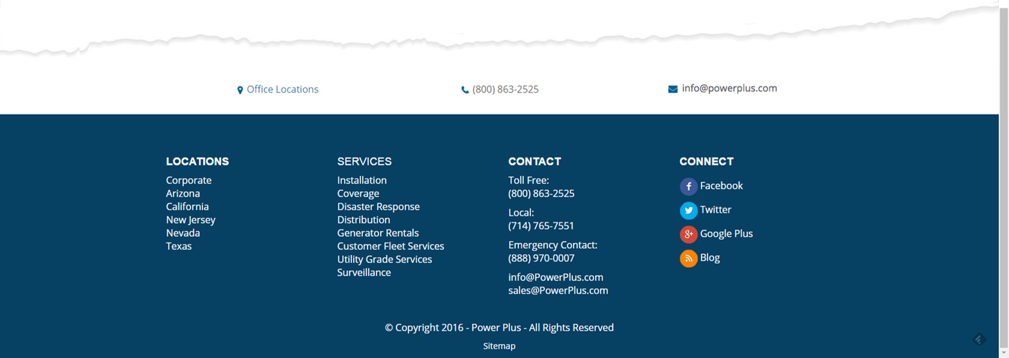
Terms of Use: The main agreement for the public to use your website. Having a TOU sets the stage for preventing abuses, laying claim to your content, terminating accounts if applicable, limiting your liability and setting the jurisdiction in case of a legal issue.
Privacy Policy: What you do (and don’t do) with the information the public gives you. Just having it can make you appear more sophisticated (yes, that was sarcasm). On a side note, a great place to put a Privacy Policy is next to a contact form where the visitor is being asked for their contact information.
Copyright Notice: Lay claim to your intellectual property. If you ever used copyscape, you might be surprised at how many people might be stealing your stuff. A copyright notice can be written or include the small, circular “c” symbol. The text often includes the year of publication and name of the copyright owner. Ironically, I stole this last sentence from someone else’s blog post. Let’s see how effective their copyright notice is.
Quick Tips for Footer Design:
How would you like me and my team to take a quick peek at your website and make some suggestions? No, we aren’t going to charge you for it. We’ll just run a website analysis and make some suggestions. Simple for us, valuable for you.

Enrollment Strategies & Support for Schools & Businesses

The Schoolmasters Guide to Enrolling more Students

The Schoolmasters Guide to Selecting the Best Marketing Team

Sometimes just doing the basics makes all the difference.
© Copyright , Kreative Webworks Inc. - All Rights Reserved