
26961 Camino De Estrella, Suite 300
Capistrano Beach, CA 9624
Call Us: (949) 276-6063
26961 Camino De Estrella, Suite 300
Capistrano Beach, CA 9624
Call Us: (949) 276-6063

Don’t make your visitors think. They’re on a mission to find what they are looking for, and you are on a mission to make sure they
find it.
People appreciate “clever”, but not at the expense of their time. Playing hide and seek with the information they are looking for and
forcing them “explore” every page on your site will not end well for you. You are only going to get so many clicks out of any visitor, so
don’t just make it easy for them to find what they are looking for, lead them down a predetermined path so they find what you want them to
find.
Rule #1: Think Like Your Customers: Nobody loves your brand more than you do. Regardless of how interesting you think you are…you probably aren’t. Few people will read every page on your website as though it was the latest John Grisham novel. Making your website information rich with lots of pages is great. Assaulting your visitors with so many navigation choices all at once isn’t.
Have a Plan: Think of in terms of paths or “silos” where similar information links to other related information to the exclusion of other topics. It’s your job to organize your content for your visitors and send them down the right path.
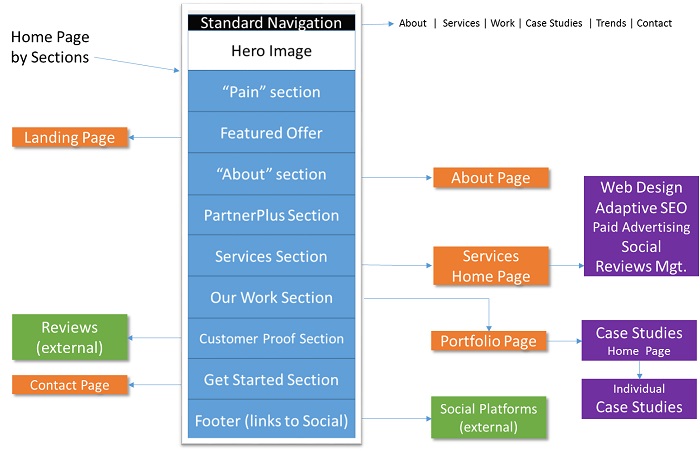
Have a Site Map: This can be a hand drawn list of your top-level pages and subpages. We prefer to use PowerPoint where we can quickly draw boxes for each page and move them around as necessary. We’ve even used yellow sticky notes on a wall for extremely large websites. Each sticky note represents a page on the website. That allows us to move pages around as we organize the site (and then take picture of it for our designers).
Here's a Sample Site Map I put together for a possible Facelift for our Company Website ↓
Pro Tip…
Limit Top-Level Pages: Visitors should be able to quickly scan the navigation and
intuitively chose the right path. Too many navigation choices is not scanning…it’s reading at that point.
Scrolling is the New Click: You may have noticed a trend towards longer pages. This is being driven by the popularity of the mobile experience. Just a short time ago common wisdom was to put everything above the fold (no scrolling). The idea was to create short pages that looked effortless to read and then click to see more.
The reality has always been that it is less effort to scroll than to click and wait for the next page to load. The mobile experience has
completely shifted the emphasis towards longer pages that circumvent waiting for new pages to load. However it is still true to put your
most important message above the fold.
Most mobile devices allow you to scroll effortlessly with your finger. The advantage is that all the information for a related topic can be quickly scanned and reviewed on a single page. This avoids clicking on to dead ends and the additional load time and bandwidth usage every time a new page is downloaded.
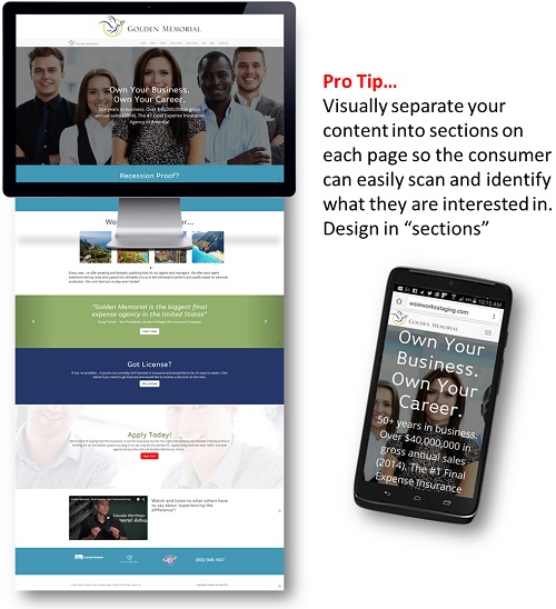
Less is More: If you use the long page scrolling style that has become ultra-popular in 2015, think in terms of
“snackable bites” or “teasers” that give your visitor a “taste” and link to the rest of the information on a separate dedicated page.
www.Evernote.com for example uses an intriguing hero shot, immediately followed by their pricing plans and then it tells what their product does using very little text. Note that there is very little for you to do but sign up for something. Not a lot of fluff.
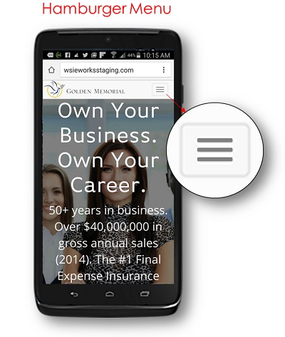
Now Serving Hamburger: There is a bit of a debate right now about the value of the “Hamburger” button (the little three-lined button on the top of mobile devices). You may notice this creeping into desktop design as a way to unify the navigation between mobile and desktop.
Clicking on the "Hamburger" expands a hidden menu to the rest of the main navigation. Some like it because it’s clean and simple, others argue that it hides your primary navigation. We advocate a hybrid of both for our clients.
The Other Rule: Think Like a Marketer: Construct your navigation in a way that all paths lead to your CTA (Cal-To-Action). That’s the desirable outcome you’re looking for, usually a phone call, email, submitted form or a transaction. The idea is to quickly give your visitor a link to what they’re looking for and gently (or overtly) navigate them down the path to your CTA. It doesn't necessarily have to be the type of navigation that appears on a navigation bar, it can be a navigation link in the middle of your pages as they scroll along.
Remember, it’s not about doing an information dump and letting the consumer fend for themselves. It’s your web developers’ job to actually help your visitors find what THEY want…so you can get what YOU want.
Want to learn more about how you can help your website development team can help you? You're welcome to down load the free Book below ↓

Enrollment Strategies & Support for Schools & Businesses

The Schoolmasters Guide to Enrolling more Students

The Schoolmasters Guide to Selecting the Best Marketing Team

Sometimes just doing the basics makes all the difference.
© Copyright , Kreative Webworks Inc. - All Rights Reserved