
26961 Camino De Estrella, Suite 300
Capistrano Beach, CA 9624
Call Us: (949) 276-6063
26961 Camino De Estrella, Suite 300
Capistrano Beach, CA 9624
Call Us: (949) 276-6063

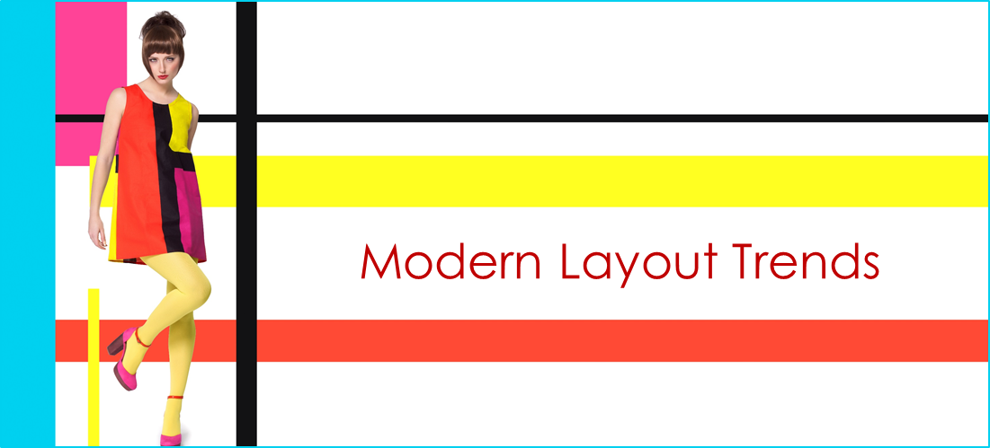
Your website should not be a hodgepodge of different styles, fonts, colors and layouts. Users adapt to what they see pretty quickly, but if you keep changing the various elements that make up your website, it not only looks unprofessional and disorganized, it makes it more difficult for them to navigate and develop a sense of confidence in your site and your service.
Below is an excerpt from the book “25 Website ‘Must Haves” for Driving Traffic, Leads & Sales”.
Layouts: Typically there is one layout for the Home page, which can be more graphically intensive and less “wordy” and a separate, but related layout for the internal pages. There might on occasion be a viable reason for a third layout for sub-pages, and certainly a separate layout for Landing Pages for specific marketing campaigns. Never play hide and seek with the navigation by moving it to different locations every time a visitor moves from page to page. Just don’t make them work that hard.
Fonts: Font selection makes a statement about your site and your business. Fonts can be boring, exciting, creative, traditional, or modern. One thing they shouldn’t be is hard to read. Limit the amount of fonts to 2 or 3 max. It OK to use specialty fonts for your headlines, but don’t stray too far from traditional fonts like Calibri, Arial, Helvetica, Verdana, Times New Roman, etc. for body copy. When pairing fonts it’s about Contrast, not conflict. Pairing certain combinations of serif and sanserif fonts can have a very pleasing affect.
Colors: How many colors should you use? Well, there is no exact answer. Too few colors and you site might look boring, too many and it might look busy. In the hands of a good designer there are no rules. However most designers agree that 3 well-paired colors is a good start. As a rule of thumb, the primary color should cover about 60% of the space, the secondary color about 30% and the accent color should clock in at about 10%.
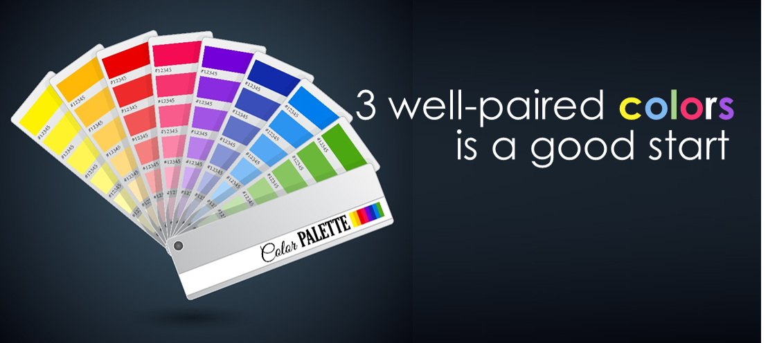
You might start with corporate colors you are already vested in (your logo or existing collateral material). A great resource for choosing color combinations that go together can be found at www.colorcombos.com.
Social Icons: No discussion on website design would be complete without mentioning the need to build social proof by including links through recognizable social icons to your social properties like Facebook, LinkedIn, Twitter, Google Plus, etc. Resist the temptation to put an icon for every social platform in existence. How disappointing for someone to click through to a social property with no activity on it. Reserve your links to only the platforms that you are going to be active on.
Want your own copy of "25 Website Must Haves" book? Download your own copy now!

Enrollment Strategies & Support for Schools & Businesses

The Schoolmasters Guide to Enrolling more Students

The Schoolmasters Guide to Selecting the Best Marketing Team

Sometimes just doing the basics makes all the difference.
© Copyright , Kreative Webworks Inc. - All Rights Reserved