How to Pick Killer Images for Your Blog!
Great blog post!

Now all it needs is a pathetically obvious piece of stock photo to complete that masterpiece.
OK Captain Obvious, should we go with the “Business Handshake”? Or maybe the person writing backwards on the invisible whiteboard? Na, let’s
go with the closeup of the browser bar…you know, the one with the HTTP?
Just a Medley of Metaphor...
This “Trio of Trash” are representative of countless of over-obvious, metaphoric, lackluster imagery that proudly screams “I’m lazy and I have no imagination!”
Are You Part of the Problem?
The problem starts with the image search. If you search a stock photo site for something obvious, that’s just what you’re going to get. Let’s take a look…
Let’s suppose I write a blog post entitled “4 Simple Things You NEED to Do with Your Domain Name”. The topics might include:
- Keeping Track of Ownership
- Buying for Defense
- Registering for Multiple Years
- Avoiding Toxic Domains
What’s the obvious image search? I’m going with “domain name”. Now let’s take a look at what we have to work with ↓

Hey look! It’s the person writing behind the invisible white board along with a bevy of “HTTP” images. Who saw that coming?
Let’s give it another try
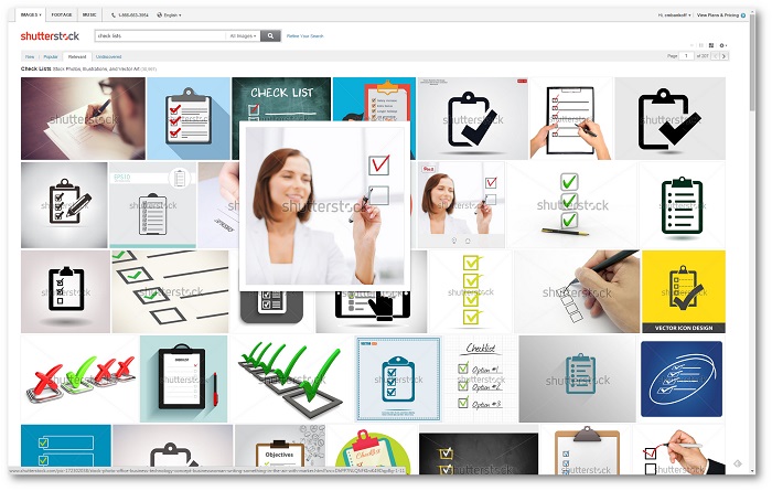
The title says that there are “4 Simple Things”. That’s just screaming out for some sort of “check list”! Let’s see what we get if we search on the phrase "check list".

Pretty boring, but at least there’s someone filling out a checklist from behind an invisible white board. We can always fall back on that.
Let’s Take a Different Approach
Based on my obvious disdain for the obvious, would it shock you if I used a term like “Think outside the box”? (insert puking noise here). So instead, let’s skip the words in the title, and just take a look at what this article is REALLY about. Maybe a little word association?
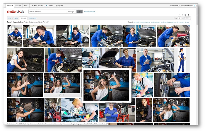
It’s really about “maintaining” your domain name. When I think of maintaining something, I think “maintenance” when I think of “maintenance” I think of cars and mechanics. I could search on “mechanic” but as long as I’m doing that, I might as well search on “female mechanic” (you just know it’s going to be more interesting).
Let’s take a look ↓

Well that’s a little more interesting. With due respect to the ladies diligently working on these fine automobiles without a smudge on their spotless jumpsuits, I’m looking for something with attitude. And here she is!

So now what are we going to do with her?
Let’s start by putting a caption just under her face for maximum attention. Problem is, the image transitions from light to dark right where we want to put our caption. Let’s put a semi-transparent background behind the caption to offset the text and make it more readable.

That should do it. The caption is focused in the middle so it won't be cut off on any of the social platforms. It's also just under her face, which is staring right back at you with her eyes drawing you in (human nature). The pose and the expression are just slightly provocative but not offensive. It has attitude and it isn't obvious.
Groovy! Let’s try another one:
I recently completed a webinar about Inbound Marketing and I wanted to make the video replay available to everyone who might have missed it. The blog tile was “The Inbound Marketing Replay” which was essentially a Step-by-Step Inbound Marketing Case Study where I made the 30-minute replay available.
The obvious image choices were “Inbound Marketing” (which actually had some pretty good photos) and “Replay” which were mostly replay buttons. Then I tried “Webinar” but there were too many people behind invisible whiteboards.
So thinking outside of the box (just puked in my mouth a little bit) I said to myself; “self, what is the perfect environment for someone to relax with this cinematic masterpiece of a real life inbound marketing case study?”
Obviously it was “coffee”
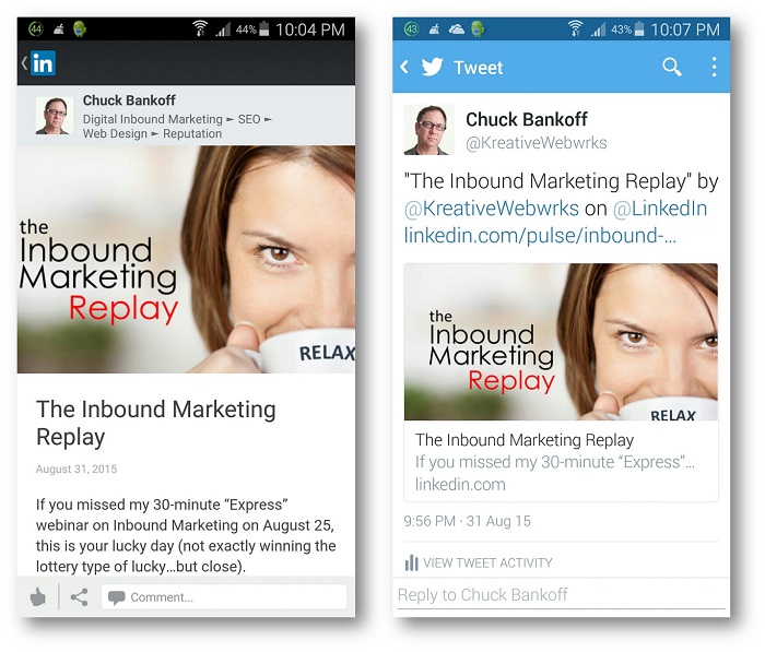
Just zoom in a little, add a caption, do some creative cropping...and presto!
And if you pay attention, you can make it look just right on all the social media and mobile platforms in one shot ↓

The Moral of the Story?
The most interesting images happen when you avoid the clichés and the obvious. Keep an eye towards where you are going to overlay the text, and remember to search on the “spirit” of the post, NOT the keywords in the title. If you want a few more tips you're welcome to download your own copy of our latest Book below ↓


