How to Produce an eBook that Generates Leads

How Can I make Money Writing an eBook?
The type of eBook I’m talking about is not the type that you download to your Kindle. It’s a well-produced piece of premium content that you offer for free as an enticement to collect a consumer’s contact information and move them farther down the sales funnel.
In most cases you aren’t going to profit directly from your eBook, so you have to strategize how you are going to monetize it. Think of your eBook as a loss-leader, or “bait”. The idea is to create something tailored for your target market’s persona that is so compelling that consumers will download it in exchange for their contact information and exposure to your “secondary” offer (the real objective).
Real Case Study…Real eBook
Let me take you through the step-by-step process of how we produced an eBook for one of our clients who provides POS (Point Of Sales) systems to retail establishments. This is essentially a software service for retailers that helps them run the essential aspects of their business. You’re welcome to download it whether you are a shop owner or not.
Who are we creating the eBook for?
We had already established our Buyer Persona who we call “Suzie Shopkeeper”. Suzie absolutely needs a good POS system…but doesn’t know it (yet). What Suzie does know is that she needs is an edge. She’s in the “Awareness” stage of her buyer journey and may respond to something more high-level and informative of a non-salesy nature. We came up with the eBook concept based on the clients own unique selling proposition and Sally’s interests.
So Where to Start?
Now that we had the general concept in place, my creative staff had to come up with an outline for our copywriters. It’s easy to just throw the title over the transom to the writers and let them sort it out, but they’re writers, not strategists. My senior team and I are closest to the client and closest to the strategy and big picture so we produced the outline.
We can't show you the actual outline for privacy reasons, but it's probably safe to say that you know what an outline is. I will tell you that each one of the outline points is just crying out to have its own blog post written about it to support the eBook distribution? That’s part of the strategy.
Cut to the Style Guide
After our client approved the outline and eventually the final copy, we now had to turn 5500 words into a slick publication based on the client’s preferences. You can use whatever software you’re comfortable with, but we used MS PowerPoint.
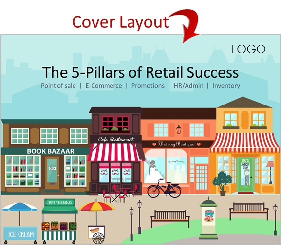
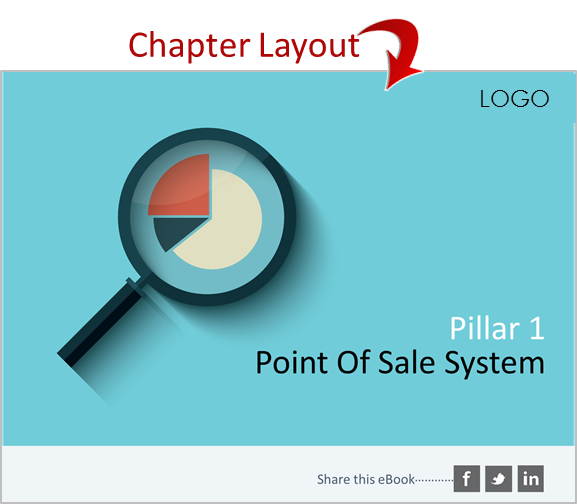
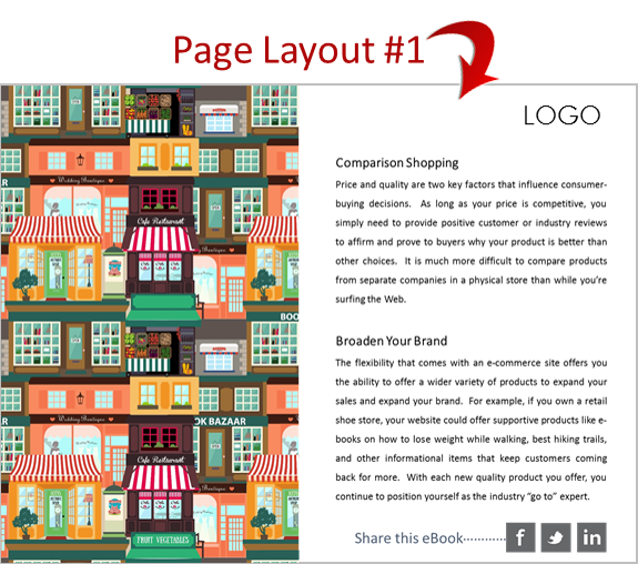
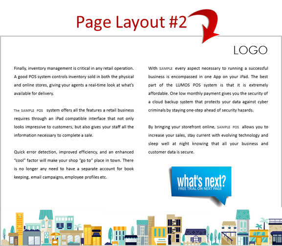
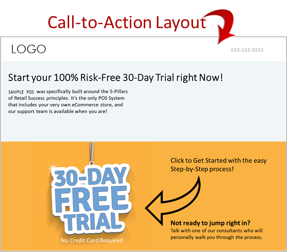
PRO TIP: Each of the “5-Pillars” is essentially a chapter. When starting the design concept, we started with a cover and an intro layout for each of the pillars. Then we established the layout for the actual information pages. Think of it as a visual outline that consist of the following elements:
- Cover Layout
- Chapter Introduction Layout
- Page Layout
- Call-To-Action Layout
Choosing Images
WARNING: Do NOT troll the Internet for images that you don’t have a license for. There is an entire industry dedicated to locating unlicensed images and levying heavy fines well in excess of the value of the actual image. We have an actual paid subscription to one of the top stock image providers, so we don’t have to compromise on photos and illustrations.
When choosing images I have 2 recommendations:
Tip #1 - Consistency: Either go with actual photos of real people and objects, or go with illustrations. (Our client indicated they were interested in using illustrations instead of photographs). Be careful if you use both or the final product may look disjointed and patched together.
With photos you can often find multiple images of the same model, or different images from the same photographer. Although it’s not necessary, this may contribute to a seamless professional feel. Same is true for illustrations by the same artist. It’s not necessary to make sure all the colors are the same, in fact using different colors in different sections of the book can help mentally segment the sections of the book.
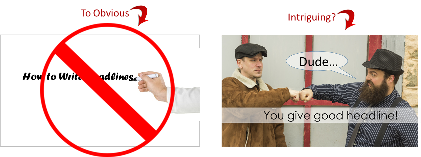
Tip #2 - Don’t Be Obvious: People like clever. Instead of searching for images based on a literal cue, consider the spirit of what is being discussed. For example, one of our “Pillars” is Inventory Management. Ask yourself- what symbolizes inventory management without actually spelling it out?
Not every page needs to have a graphic, photo or image. Sometimes a book can function as a book. It might actually be monotonous and distracting to have different images on each and every page.
You will also want to establish your fonts as part of your style guide. It’s ok to use 2 and sometimes 3 different fonts throughout the publication, but just use them consistently. One font style and size for headlines, and a different one for body copy, etc.
Publish & Promote
Before publishing your masterpiece, consider how you will get it into the hands of your target market. The eBook itself should have a built-in Call-To-Action, but if you don’t “gate” the content (make it accessible by having to first fill out a form that captures their contact information) you’re missing the point. Here is a separate article we wrote about a landing page strategy that we used for ourselves.
Just publishing your eBook doesn’t mean that it will ever see the light of day. Unless you strategically and aggressively promote it on search engines and social media, it might as well be a notation on your personal diary.
Our most basic strategy includes creating multiple blog articles about specific elements of the eBook, and then promoting them via social media. The strategy is to get people to the eBook by first getting them to the blog posts. Each blog post can be optimized for search engines and supported by social media.
But eBook promotion is a topic by itself. Perhaps we should write an eBook about it?
