Coming up with Killer Web Image Ideas
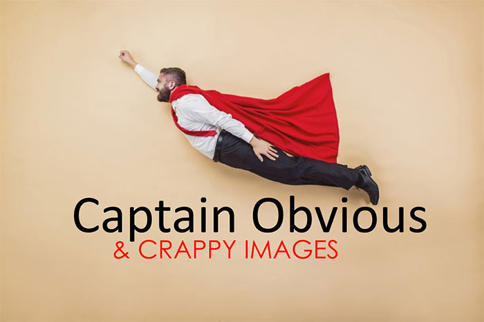
OK Captain Obvious, you created your Buyer Personas and know exactly who you are targeting. You wrote some killer copy for your website, created a great offer and have your Calls To Action ready to go. But something’s missing…
Ahh, I know….images! We need some pictures for eye candy to pull the design together. It’s off to the stock photo well again!
Let’s see…we run a business, businesses have contracts, people agree on the terms of a contract. I know…
Behold my image selection!

Is there any picture on any business website since the 1990’s that screams “I’m just mailing this in” more than the obligatory handshake picture? I checked and ShutterStock alone has at least 22,350 of virtually the same photo.
Stock Photo services like iStock and ShutterStock offer some terrific high-quality images for virtually any occasion. Many of them show a great deal of creativity. The problem is many of us don’t show a great deal of creativity when we use them.
Which Image Would You Choose?
You’re writing an eBook and one of the sections is about “Getting Found Online”. You go to your stock image source and you search for “SEO”. Pretty easy to find a lot of blatant “in your face” SEO images. Some of them are actually pretty good, and I would certainly consider using them. Let’s take a look at a couple of possibilities:

When I think of getting found online, (especially within the context of the eBook I’m writing) I think of SEO. So naturally I search my stock image source for “SEO”. What do you think I’m going to get? Lots of symbolism, and the actual letters “SEO”.
The image on the left is actually not that bad. After conducting the image search, I might have even used that one (given my choices to select from).
I knew basically what the results would be for an image search on “SEO” so I specifically avoided that search term in favor of something that would imply “getting found online” without actually saying it. My thought was that your customers may be searching for you from anywhere, and nothing screams anywhere like a restroom.
The actual search term I used to locate the image on the right was “Searching the internet in a restroom”. Is it a better image for the occasion? I think so…but you already knew that.
The reason I think it is a better image for this purpose is that it isn’t obvious, it’s just unusual enough to not be mentally filtered out, and the concept of people actually searching from virtually anywhere is stronger than the symbolism of a nicely Photoshoped, yet obvious filler picture.
Which image would you choose?
When the Picture Doesn’t Speak for Itself
One thing those two images above have in common is that they both somehow make their points as-is. Sometimes your images need a little help to tie them into the theme. A popular technique is to simply augment an otherwise unrelated image by embedding a caption directly onto the image.
Making Irrelevant Images Relevant
The images on the left are just the way they were downloaded from my stock photo source. The images on the right use simple captions to tie them into the theme for each blog. If you like, you can click on any image to read the actual blog.

The image above was augmented for a blog we called “Can One-Time Search Engine Optimization really Work?” The theme was that there is no SEO in a box you can just tap into. You actually had to do a lot of work to get top rankings in Google. If you were searching images for “SEO” you wouldn’t have come across this image. The idea came first, and then the image. It’s just a matter of thinking outside the box (sorry).

The image above was for a blog article we called “What Impact did a Website Redesign have on this Glass & Mirror Company?” In this case we didn’t do anything tricky. Just a play on the old time paper boy shouting “Extra! Extra!” The caption wasn’t designed to be clever, just relevant to this particular target audience.

The image above was for a blog article we called “How to Give Good Headline”. An article about… you guested it; how to write good headlines. You might ask, what do two Bros fist-bumping have to do with writing good headlines. Well nothing until we added the comic book like captions.
In all cases notice that the captions on the images were related to…but not the same as the titles. If they were the same, it would look redundant.
Don’t be Obvious
If your blog, web page, eBook or social post is about “iPad based POS systems” don’t be searching for pictures of iPads. Search for images of retailers in a shop environment. If your webpage is for a law firm, resist the urge to use those tired images of gavels and courthouse columns in favor the geographic area the firm services, or an image of the building or the office where the firm is located.
You don’t necessarily have to be clever, just don’t be cliché.